
Sections, like pieces of a puzzle, fits together to form a clear picture of your space’s current state—helping you review and adapt your delivery plan. Each report is made up of multiple customizable primary and pop-up sections, which are detailed in the following article.
Primary sections
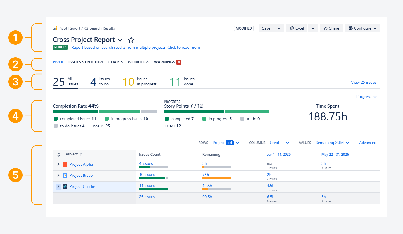
A report consists of six primary sections, five of which are shown in the screenshot above.
-
Header: Set the report’s description, sharing permissions, and configurations, and export its contents.
-
Tabs: Navigate between different configured report views.
-
Slices: Use JQL to filter the report and display custom indicators.
-
Progress: Display indicators to monitor Status, Completion, and other metrics.
-
Summary: Group and tabulate the report’s contents and explore indicators further.
Each section consists several interactable elements, which are detailed as follows.
Header
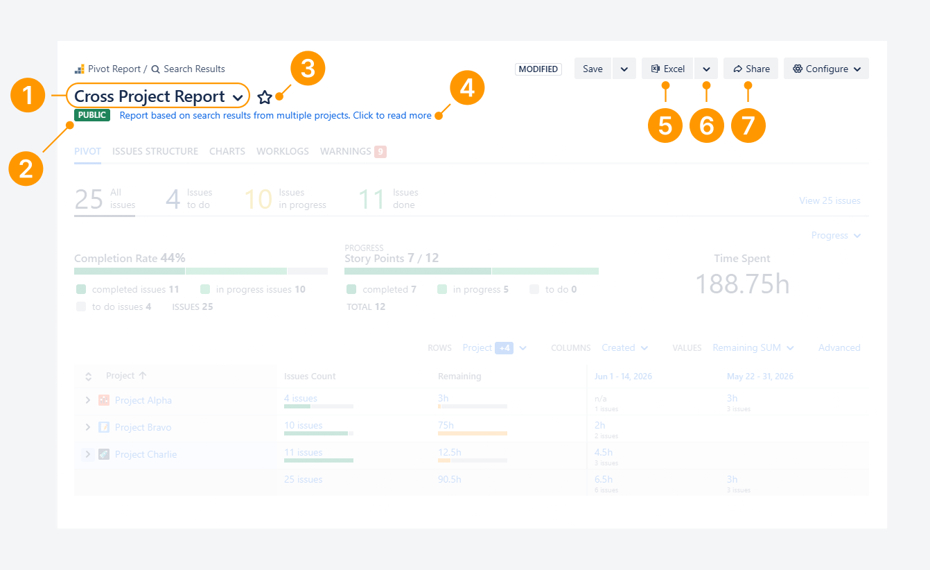
The Header section lets you share the report with internal users or export it for external users. It also provides quick access to your reports, linked pages or notes, and the report's configuration settings.
The following elements are available in the Header section and can be used to perform these actions:
-
Name: Displays the report name. Select the down arrowhead (⌄) to access a list of your most frequently used reports.
-
Sharing type: Displays a color-coded icon and text indicating the report's access permissions. In the screenshot above, a green square labeled Public is displayed.
Select the text to open the Sharing Settings pop-up. -
Favorite: Select the star icon to mark the report as a favorite, making it easier to find among your reports.
-
Description: Displays the report description as plain text or as a hyperlink to an external webpage.
-
Excel: Exports the report to a Microsoft Excel workbook.
-
Export options: Select the arrowhead (⌄) to open a dropdown menu with additional export options, including HTML, PDF, and Confluence.
-
Share: Copies the report URL to your clipboard.
Other buttons:
-
Save a copy: Store a duplicate version of the report, which you can edit.
-
Configure: Access the report sidebar, which allows you to configure the current report tab.
Tabs
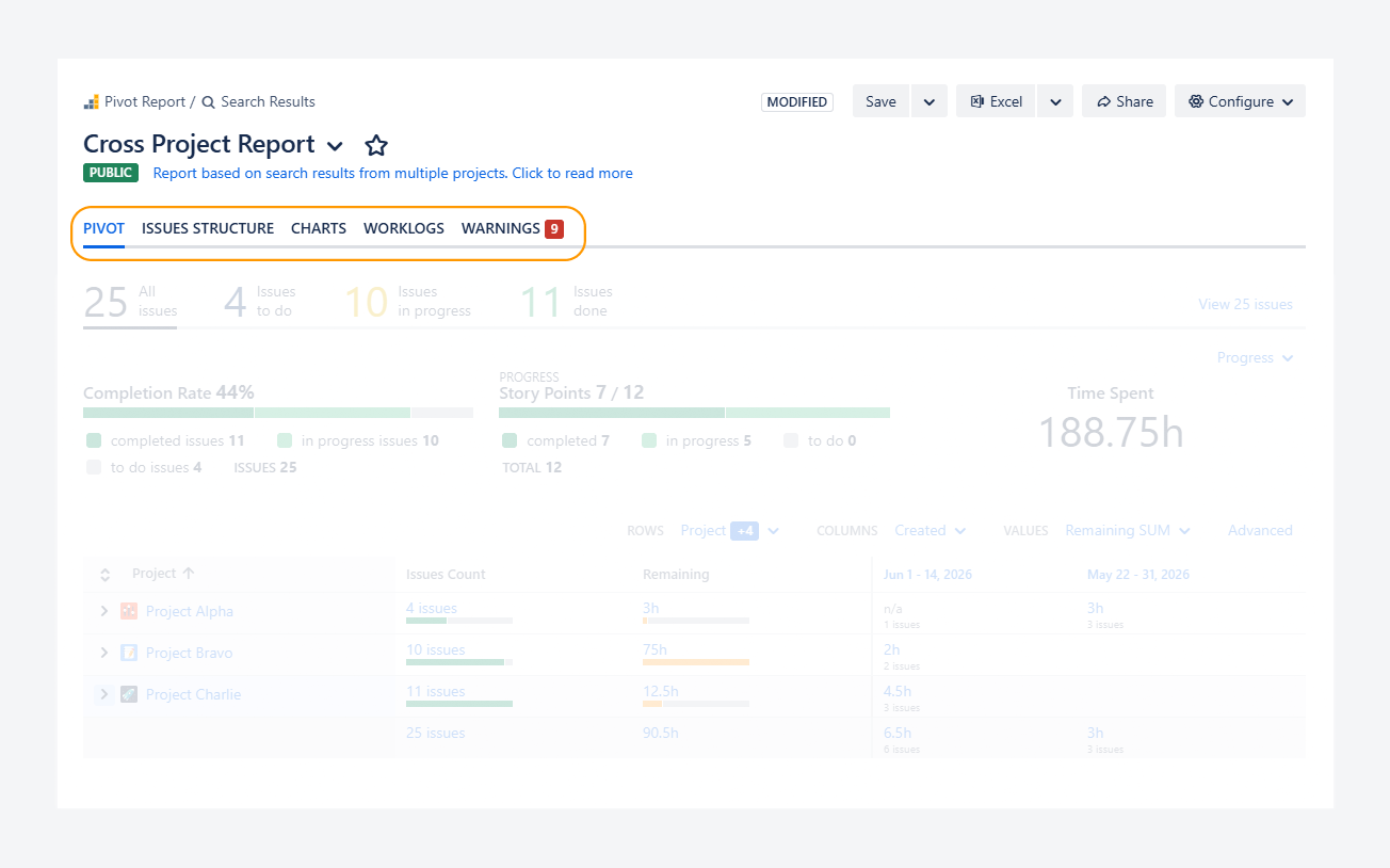
The Tabs section works similarly to sheets in a Microsoft Excel workbook. It allows you to focus on different aspects of your Jira data while using the same report source. For more information about this section, refer to the related article.
For example, you can compare how one field affects another, track leading or lagging indicators using Warnings, and more.
Slices
This section allows you to filter the contents of the entire report by selecting one Slice at a time. A Slice can also be used to display a numerical value or a time-based metric. To learn more about this section, refer to the related article.
In the example below, a Slice shows that there are 4 work items in the To Do status category.
-20260625-204308.png?cb=7940effb85ac2ac650b80655e870f55d)
Progress
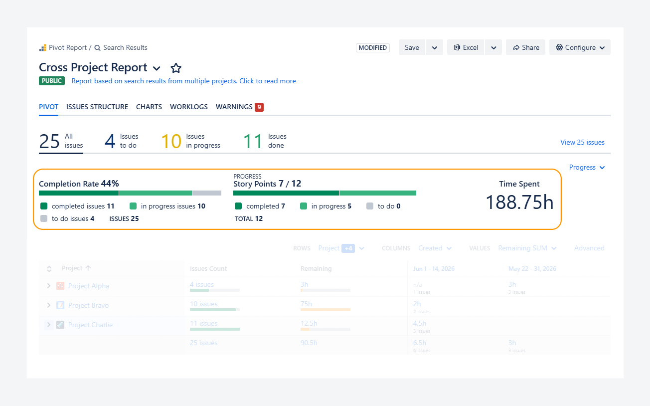
The Progress section helps you track completed and remaining work. It offers a variety of indicators, such as Completion Rate, Completion by Time, Story Points, and custom fields, allowing you to choose the metric that best fits your reporting needs. To learn more about this section, refer to the related article.
In the example below, the progress indicator shows that 7 of 12 story points have been completed. In other words, work items in the Done status category have a combined total of 7 story points.
Summary
The Summary section helps you categorize the contents of the report source in a table format. Its layout changes depending on the active tab, and you can configure its rows, columns, and groupings.
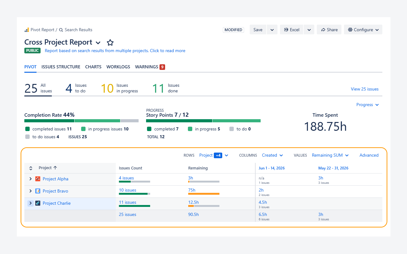
Breakdown
The Breakdown section provides a detailed view of the data summarized in the Summary section. It allows you to enable additional columns that support Jira system fields, app fields, and custom fields.
-20260625-205508.png?cb=c7ab3af99e9607d189f96bbc3dbea2a8)
Pop-up sections
When users interact with the report's primary sections—for example, by clicking an element in a progress indicator—secondary sections or pop-ups appear to provide additional context without taking them away from the main report.
Each report includes two types of pop-up sections.
Breakdown Pop-up
The Breakdown Pop-up shows a condensed view of report data, letting you explore the details of each Jira work item without leaving the report. This pop-up is disabled for the Work item Structure tab, since its Summary section already contain the contents of the Breakdown section.
You can open this pop-up by clicking on elements in the Summary or Progress sections or in Charts tab, by using the steps below.
Summary section
You can open a Breakdown Pop-up from the Summary section by clicking elements in the Pivot, Worklogs, Capacity, or Warnings tab types.
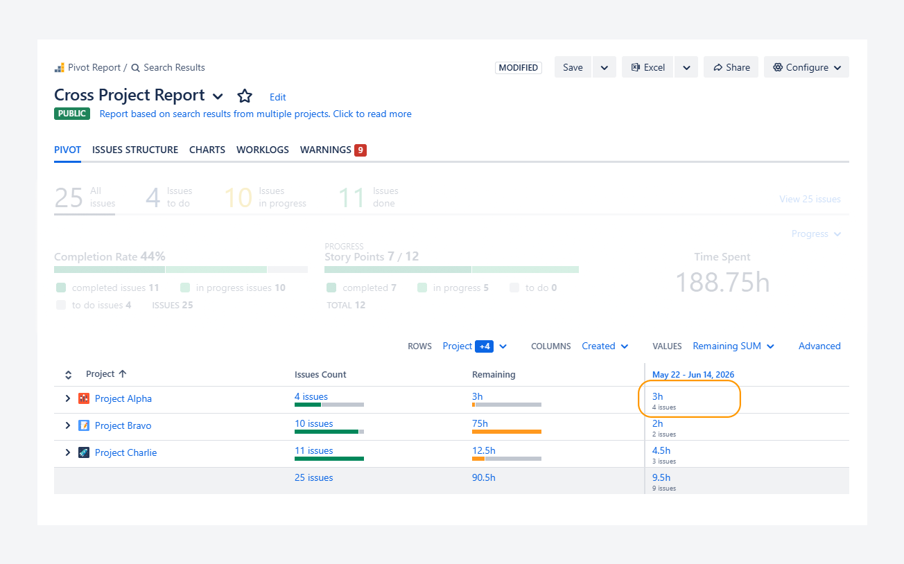
As shown in the below screenshot, you can navigate to this element at the intersection of a row subtotal and a column grouping.
-20260625-212841.png?cb=3f51a2b37ab54eda87b8fbb7e439a596)
-
Row: (Space > Status category > Priority > Assignee > Work Type)
Low-priority completed sub-tasks belonging to Space Alpha and assigned to Adam Grant appear in this row. -
Column: The Created Date for work items appears in this column.
-
Value: A clickable element appears at the intersection of the row and column.
In this example, it shows the sum of remaining time for sub-tasks created within the selected date range. It is also displayed as a clickable numeric value.
By clicking the first row for the Space, where 3 remaining hours are shown in the column, a Breakdown pop-up appears, as shown in the screenshot below.
-20260625-213137.png?cb=debbc7fc212e567a993cdf0858814c74)
-
Row: (Space > Status category > Priority > Assignee > Issue Type)
Low-priority completed sub-tasks belonging to Project Alpha and assigned to Adam Grant appear in this row. -
Column: The Created Date for issues appears in this column.
-
Value: A clickable element appears at the intersection of the row and column.
In this example, it shows the sum of remaining time for sub-tasks created within the selected date range. It is also displayed as a clickable numeric value.
By clicking the first row for the Space, where 3 remaining hours are shown in the column, a Breakdown pop-up appears, as shown in the screenshot below.
Progress indicators
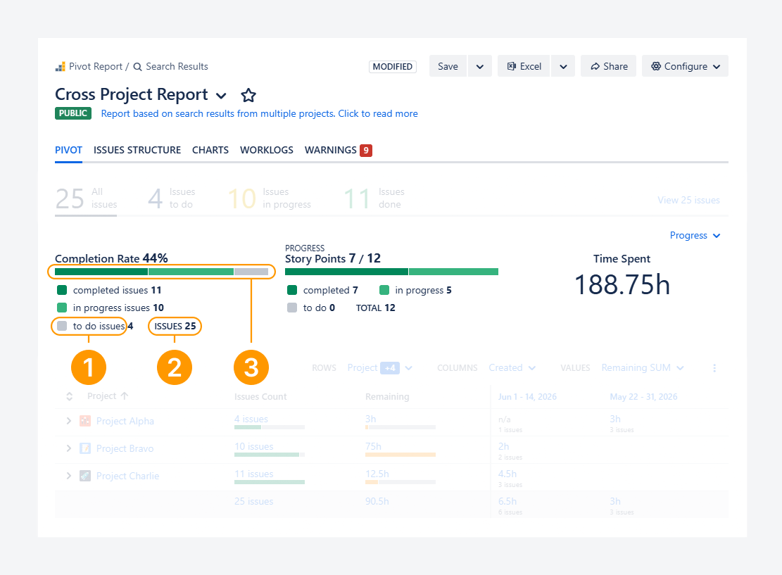
You can open a Breakdown Pop-up from the Progress section by clicking on an element belonging to a progress indicator —like a label, colored bar, or value, as shown in the below screenshot.
-
Label: The count of Work items To Do appears in this label.
-
Clicking on this element will open a Breakdown pop-up showing all 4 work items.
-
Value: This value corresponds to the total amount of work items considered by the progress indicator.
-
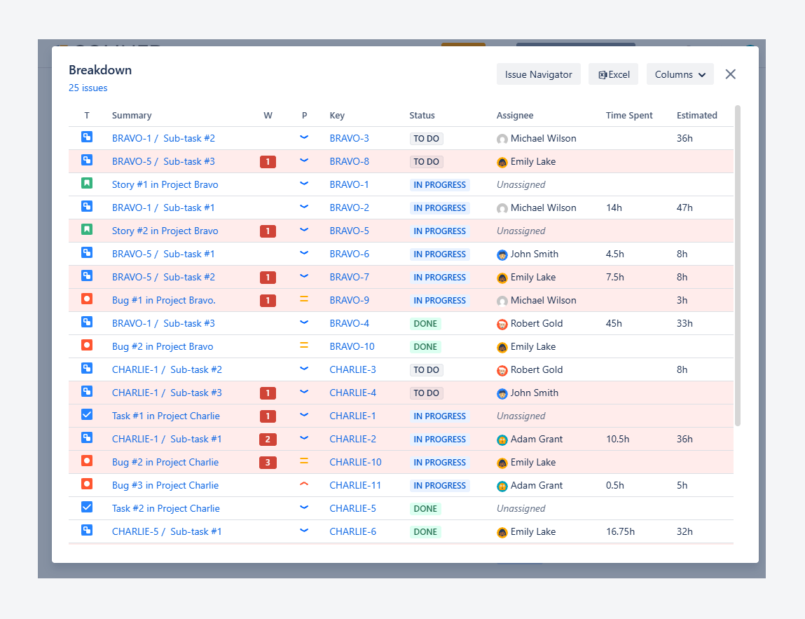
Clicking on this element will open a pop-up showing all 25 work items regardless of their status category.
-
Colored bar: This bar is linked to the count of Work items To Do.
-
Clicking on this element will open a pop-up showing all 4 work items, as shown in this example.
By clicking on on the label or the colored bar, 4 work items left To Do will appear within the Breakdown Pop-up.
-20260625-200203.png?cb=26cf68e03d435ee72aefa80088decff7)
Chart
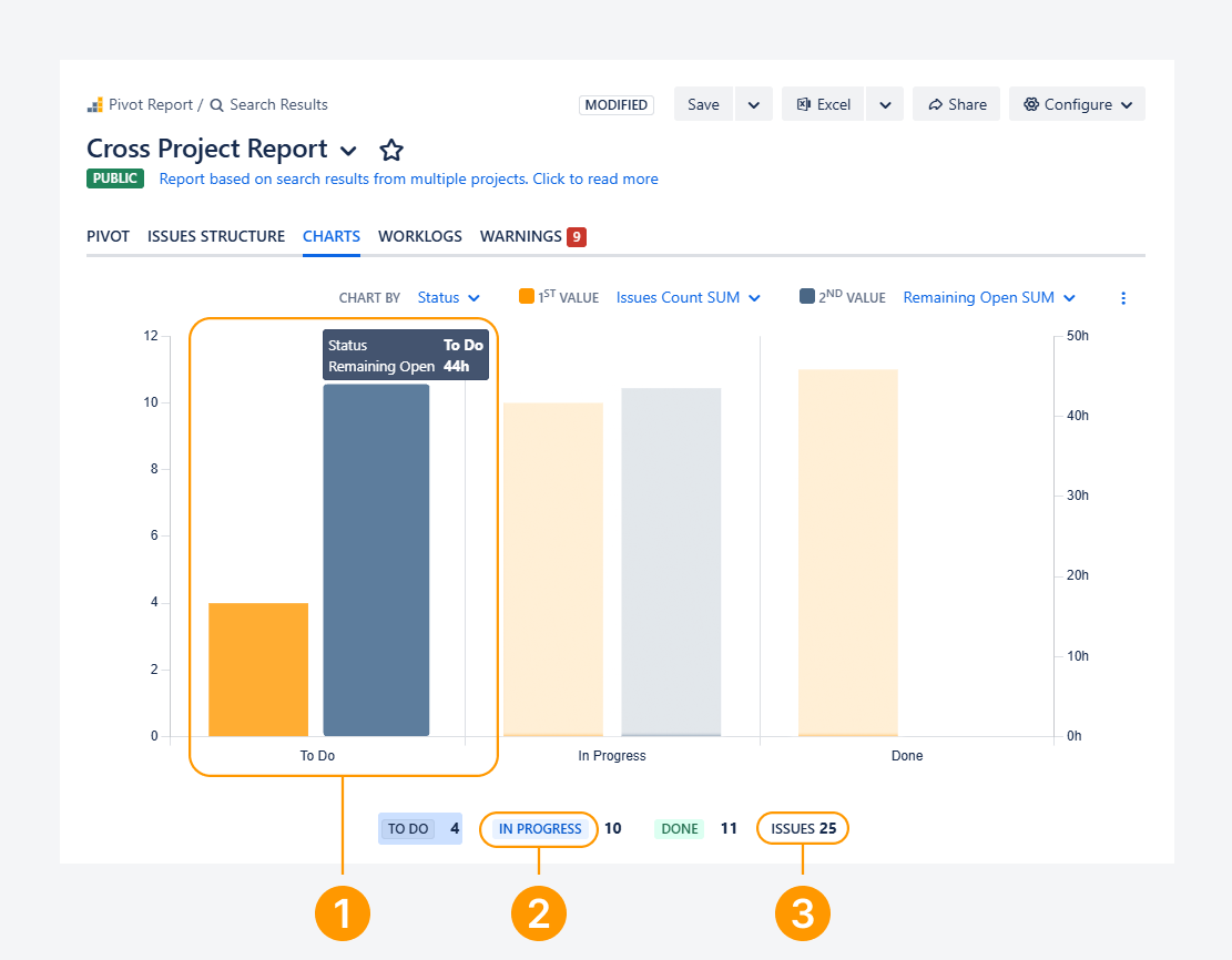
You can open a Breakdown Pop-up from the Charts tab by clicking on an element belonging to a chart —like a label, colored bar, or value, as shown in the below screenshot.
-
Colored bar: This bar represents the number of work items that are currently In Progress.
Hovering over the grey bar displays a tooltip showing the label and value associated with the bar.
Clicking the grey bar opens a Breakdown pop-up containing all 4 work items represented by the bar.
-
Label: The label displays the number of work items that are currently In Progress.
Clicking the label opens a Breakdown pop-up containing all 10 work items in this category.
-
Value: This value represents the total number of work items included in the chart.
Clicking the value opens a Breakdown pop-up containing all 25 work items, as shown in the screenshot below.
Work item View Pop-up
The Work item Issue pop-up window displays the Jira Work item view for the selected work item, allowing you to view and edit it without leaving the report.
You can open it from the Summary section of the Issue Structure tab or from the Breakdown pop-up available in all other tab types.
FAQ
Tabs
Slices
Progress indicators
Breakdown section
Pop-up section
Can you edit issues using the Issue View pop-up?
Yes. You can edit work items directly from the Work item View pop-up, as long as your user account has the required field edit permissions. These permissions are managed by your Jira administrator.
After editing an work item in the Work item View pop-up, the report will prompt you to save and reload your changes by clicking the ‘Reload report’ button, as shown in the screenshot.
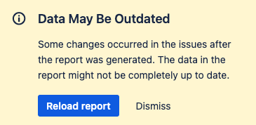
This step is required because your edits have changed the report’s source data.
Troubleshooting
Breakdown section
Can you resolve an error that appears when using the Breakdown pop-up?
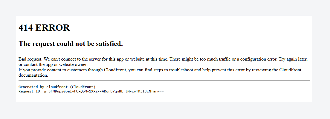
The error above may appear after clicking the work item count (left-hand side) or the Issue Navigator button (right-hand side) shown in the Breakdown pop-up.
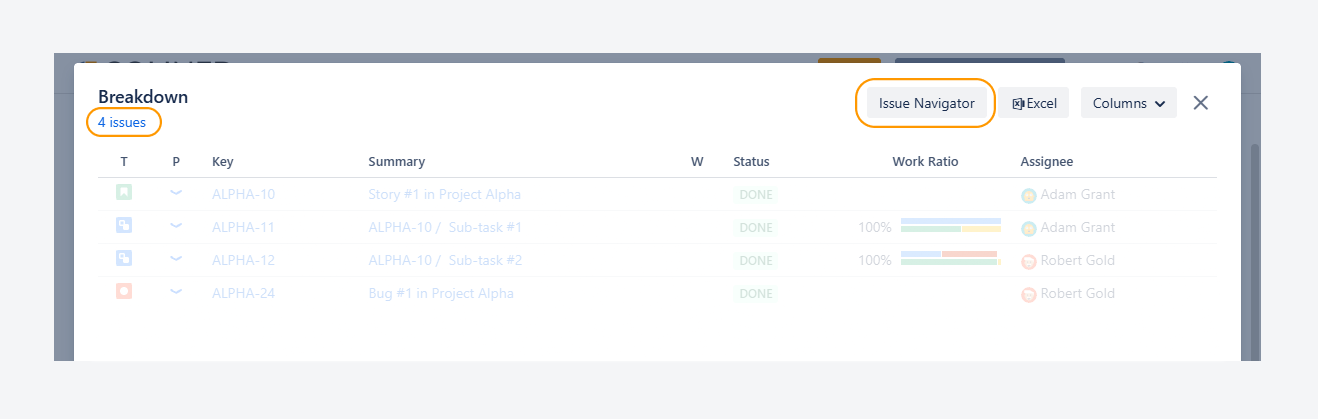
This error typically occurs due to two conditions: when the space key contains more than two letters, and when more than 1,000 work items are displayed in the Breakdown pop-up.
For example, if 1,300 work items appear for the CSD space, an error may occur when attempting to open the Issue Navigator from the pop-up.
To resolve this error, reduce the number of work items displayed in the pop-up by using slices. For example, filter work items based on the status category.
If you have questions or need assistance, contact our support team via email or service desk. Our team is available Monday through Friday (9:00 AM to 7:00 PM GMT+7) to help with technical challenges or discuss improvements.