
This article explains why and how to use the Pivot tab type within a report.
If you want to edit this tab, refer to a separate article.
Why should you use this tab type?
You can use the Pivot tab type to organize and group data into rows and columns and apply aggregated values—such as sum, count, or average—at their intersection to answer “what if” questions. You can explore the data further by adding or removing fields as needed.
This tab type is often used as a starting point for analyzing work progress or preparing a space or fix version retrospective.
Features and use cases
Refine your Backlog without modifying Board settings
-20260319-002319.png?cb=74063d4cb51ffb73c00f683e1bc5add6)
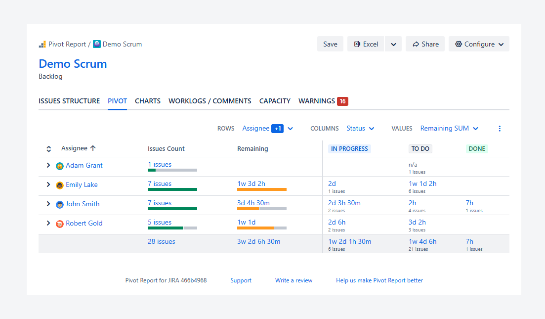
You can create a report for a Board’s Backlog and then use the Pivot tab to group work items by priority, remaining effort, assignee, and status. To reproduce this report, you can use the example shown in the screenshot or create your own report from a board on the demo site.
The grouping in the Pivot tab lets you see the remaining effort for each deliverable by assignee. This helps you identify whose backlog contains the most urgent work and estimate how likely it is to be completed in upcoming sprints.
For example, one team member may need two days to complete a highest-priority work item before starting another high-priority task. Based on this insight, you may choose to reassign the second task to another team member so work can begin sooner when it moves into a sprint.
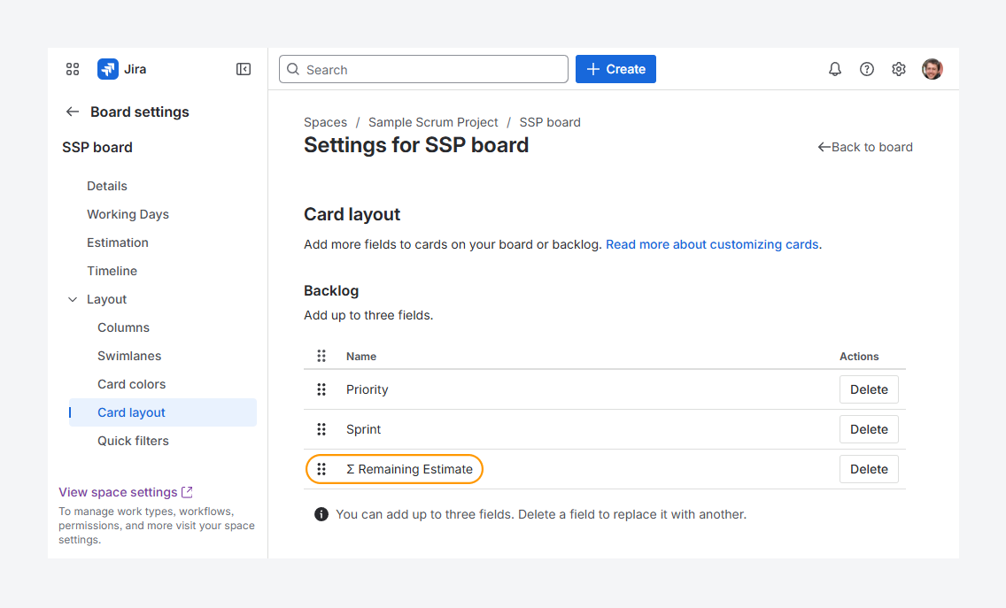
Using the Pivot tab also removes the need to add Remaining Estimate to the card layout in your Board settings for backlog refinement. You can update and reassign work items directly from the work item view by selecting items in the Summary section of the tab. After making changes, you can refresh the report without reloading the entire page.
Display progress indicators as values
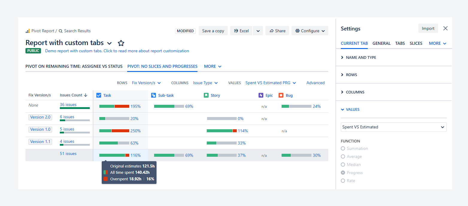
Yes. You can display progress indicators as values. In the example above, Spent vs Estimated is used to show how much time was spent compared to the original estimate for each work item type and release.
This indicator appears as a horizontal stacked bar. Time spent is shown in green as long as it remains within the original estimate, while the remaining time is shown in grey. When the estimate is exceeded, the overspent portion appears in red, and the green segment decreases proportionally relative to the total time spent.
When you click the progress indicator, a tooltip displays the time spent, the original estimate, and the amount of time exceeded.
To recreate this report, you can follow the example on the demo site. For more details on available progress indicators and their definitions, refer to the related article.
Display the average duration of commonly named tasks
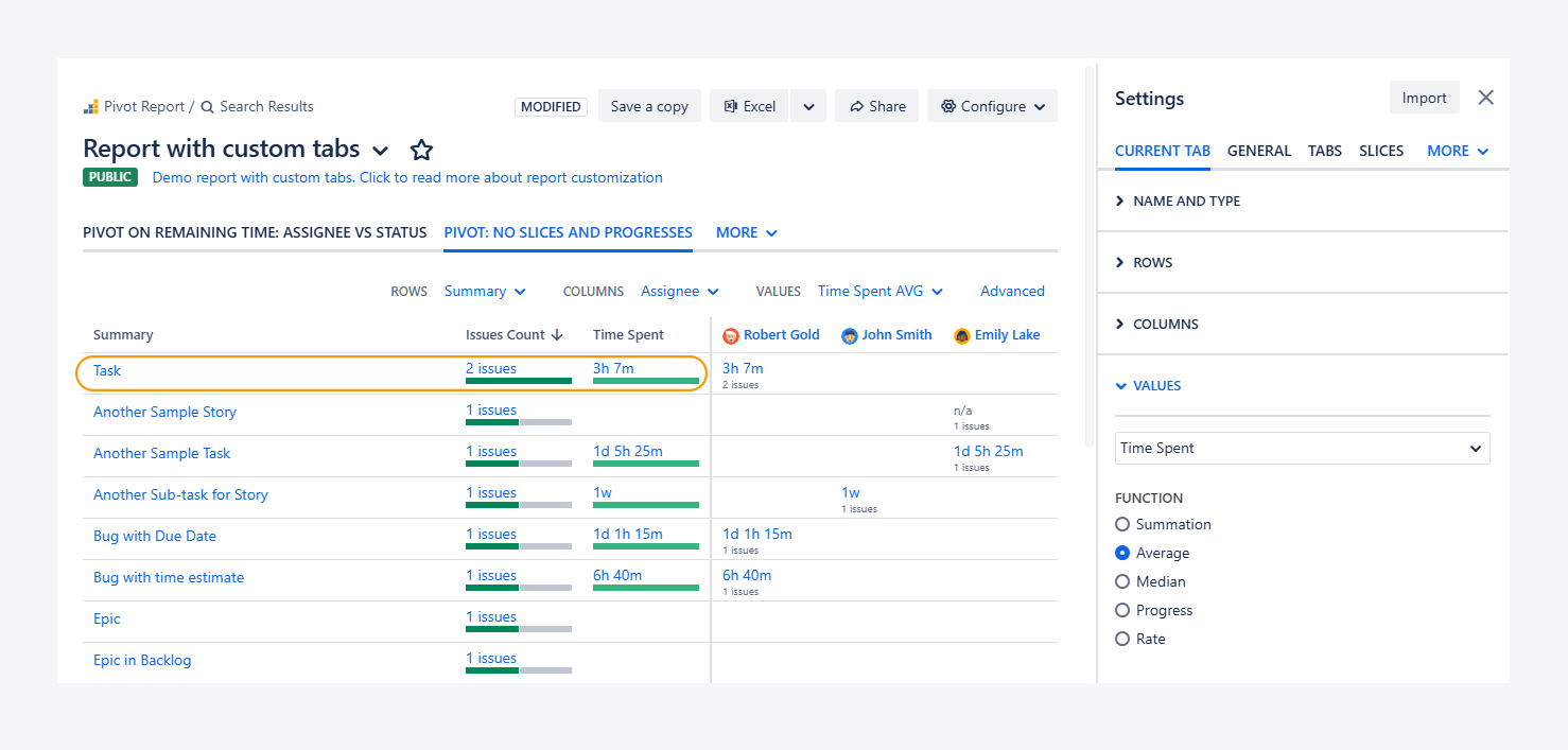
You can use this tab to measure the average time spent is shown for a repetitive task occurring in every Fix Version, such as a setup, merging, and packaging activity.
Display how time is spent on QA or bugs per release
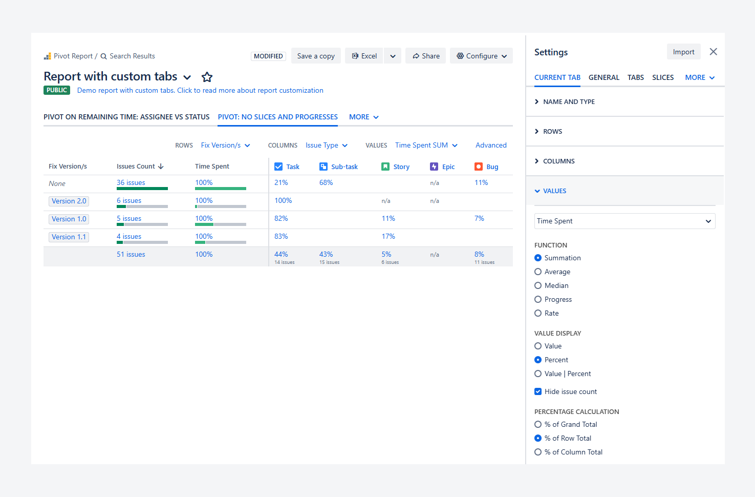
Yes. You can use the % Row to identify which Fix Versions and Epics have the highest share of time spent on resolving bugs rather than on development work.
In the example above, 7% of the time in Version 1.0 was spent on bug resolution. In comparison, 11% of the time was spent on bugs without a version, which were likely removed from a previous version and moved to the backlog for reassignment.
This Summary section helps you assess how much time is spent on bugs across versions and whether a consistent percentage trend exists.
Based on this insight, you can estimate that a similar share of time may be required for bug fixing in upcoming releases and plan your budget accordingly.
How can you configure this tab?
The Pivot tab type includes the following options for configuring the table located within Summary section.
-
Name and type: Click inside the text box to rename the selected tab.
-
Rows, Columns, and Values: Check these options to modify the contents of the Summary section for the selected tab.
-
Breakdown: Click on the toggle switch to either hide or show the Breakdown section within the selected tab type. This options is available for Pivot, Capacity, Worklogs, and Warnings tab types.
-
Display options: Check Show slices, Show progress, or both, to show these sections within the selected tab.
Rows, Columns, and Values are introduced further below.
Rows
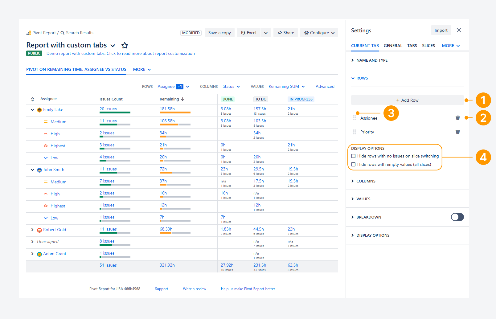
The options shown in the screenshot allow you to reorder, remove existing rows, or add new ones.
-
Activate a row: Click Add Row, open the dropdown menu, and select the row you want to add.
-
Remove a row: Click the bin icon on the row card to remove it.
-
Reorder a row: Drag the row using the grid icon (the dotted handle on the left side of the card) to change its position.
-
Check display options: Select the appropriate checkbox to hide rows with no work items, either when switching between slices or across all slices, including the All Work items slice.
Columns
The options shown in the screenshot let you manage columns by reordering them, removing existing ones, adding new ones, hiding default columns, or grouping column values.
-20260402-012719.png?cb=59c32092de4906c7b667bded1c7e5163)
-
Activate a column: Click Add Column, open the dropdown menu, and select the column you want to add.
-
Remove a column: Click the bin icon on the column card to remove it.
-
Reorder a column: Drag the column using the grid icon (the dotted handle on the left side of the card) to change its position.
-
Sort a column: Open the column’s dropdown menu and choose how to sort the column: by order, work item count, or value (based on the column subtotal). Then select whether the sorting should be ascending or descending. If multiple column cards are present, only the column shown in the top card will be sorted.
Fields such as Status, Priority, and Work item Type follow the ranking defined in Jira settings, which you can customize. Date fields are sorted chronologically when ascending order is selected.
-
Column display options: Select the relevant checkbox to hide default columns in the Summary section, such as those showing work item counts or row totals.
-
Value grouping: Enable Grouping to group column values. This option is available when you use date-based fields, such as comment date, worklog date, or due date, as well as number-based fields like comments, story points, or other numeric fields. If multiple column cards are present, only the column shown in the top card is grouped.
For date fields, values can be grouped by one week, two weeks, one month, one quarter, or one year. You can define the start and end dates manually or allow them to be set automatically.
For number-based fields, such as comments or story points, values are grouped using a number that defines the step between each group. Start and end values can also be set manually or left to auto-set. Only whole numbers can be entered.
Values
The options shown in the screenshot let you control the contents of each cell in the table created from rows and columns.
-20260402-013616.png?cb=4e4d6d4f533602a4edd1ba5f042eb7ce)
-
Select a value: Open the dropdown menu and choose the value to display in the table.
When the app is used with Jira Service Management, additional values become available: External, Internal, Agent, and Customer Comments. Each of these values shows the comment count for its category. By default, all customer comments are treated as external.
-
Choose how values are calculated: Choose how the value is displayed: as a sum, average, median, progress indicator (based on status category), or rate (such as a completion rate).
-
Choose how values are displayed: Decide whether the value appears as a number, as a percentage, or as a combined Value | Percent in the same cell. You can also choose to hide the work item count shown alongside the value.
-
Define percentage calculation: When using Percent or Value | Percent, specify how the percentage is calculated. Each cell can show a percentage based on the grand total of the table (all rows and columns), the row total, or the column total.
FAQ
Can you select the same field for Rows and Columns?
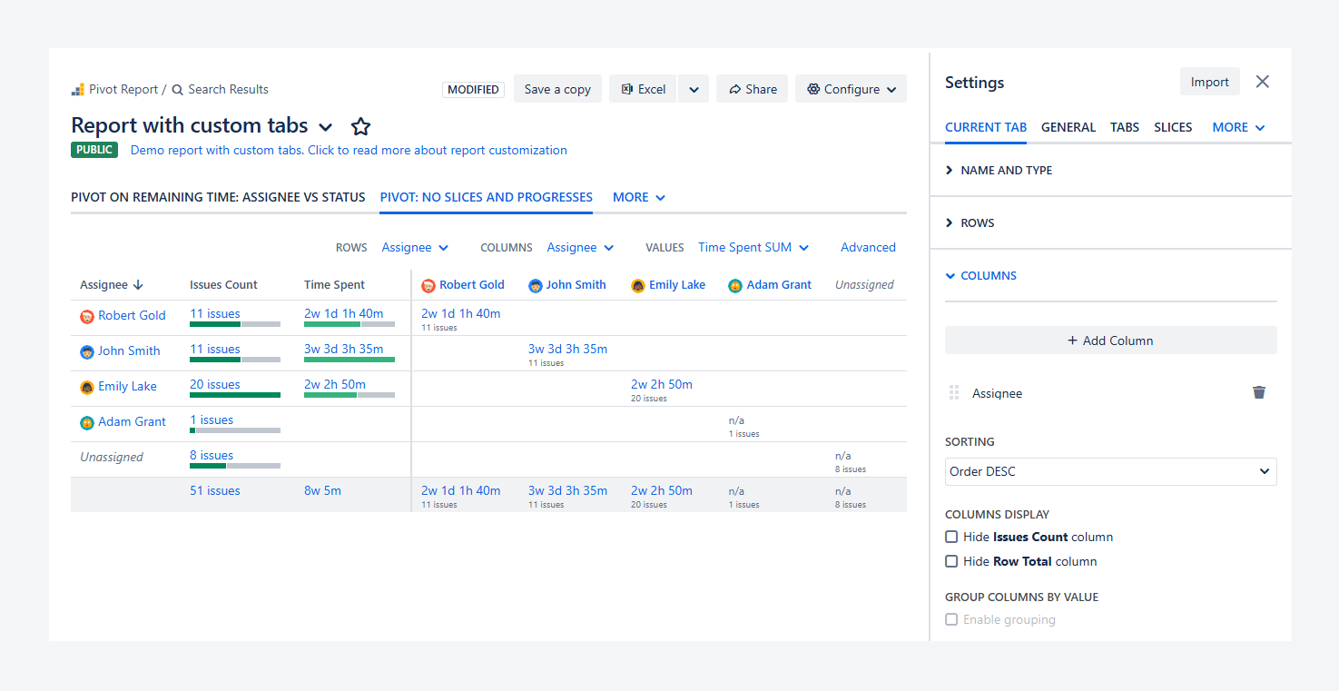
Yes. You can select the same field for both Rows and Columns.
Doing so will result in duplicated data. For example, if Time Spent is set as the Values field, using the same field for Rows and Columns can help you understand how your Jira data is displayed in the Summary section.
This approach is often useful as a learning step before adding different fields to Rows and Columns.
Can Rows and Columns contain blank values?
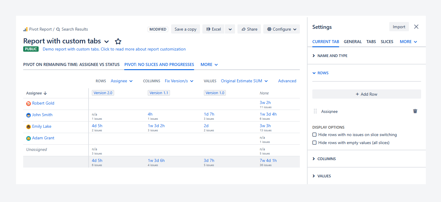
Yes. Rows and Columns can contain blank values.
When a value is missing, it can appear in different forms depending on the field used. For example, if you set Work item and Assignee as either Rows or Columns, work items without an assigned user will appear as Unassigned.
Similarly, if you set Project and Fix Version/s as either Rows or Columns, work items that are not linked to any version will appear as None.
Can rollup fields appear as columns?
-20260401-234027.png?cb=5d296b33dcd12accd312e775c53e5094)
Rollup fields—such as ∑ Original Estimate, ∑ Time Spent, and ∑ Remaining Estimate—available in Jira’s Issue Navigator can also be displayed as values in the Summary section when using the Summation function (for example, shown as Original Estimate SUM in the screenshot above).
However, only standard fields—such as Original Estimate, Time Spent, and Remaining Estimate—can be displayed in the Breakdown section (for example, shown as Estimated).
Can you display a deliverable where multiple users entered worklogs?
No. You cannot display a work item where multiple users have logged work in the Pivot tab type. In this tab type, the current assignee can be used as a field in Rows or Columns, but assignee history is not available in reports.
In comparison, you can display work items with work logged by multiple users in the Worklogs/Comments tab type, as described in a related article.
-20260401-231953.png?cb=36c141695b54cd5879c5795e70cbe6dc)
As shown in the example above, when Jira’s default time tracking is enabled and the Worklogs/Comments tab type is used, set Work item Type and Assignee as columns and User as rows. This will allow you to see whether a user logged time on work items they are or are no longer assigned to within the selected time period.
Note that when using Tempo Timesheets this level of detail is not available. In that case, Timesheets by Tempo appears as a single user, so individual users who logged time on a work item cannot be identified.
Can you sort Issue count and Row Total columns?
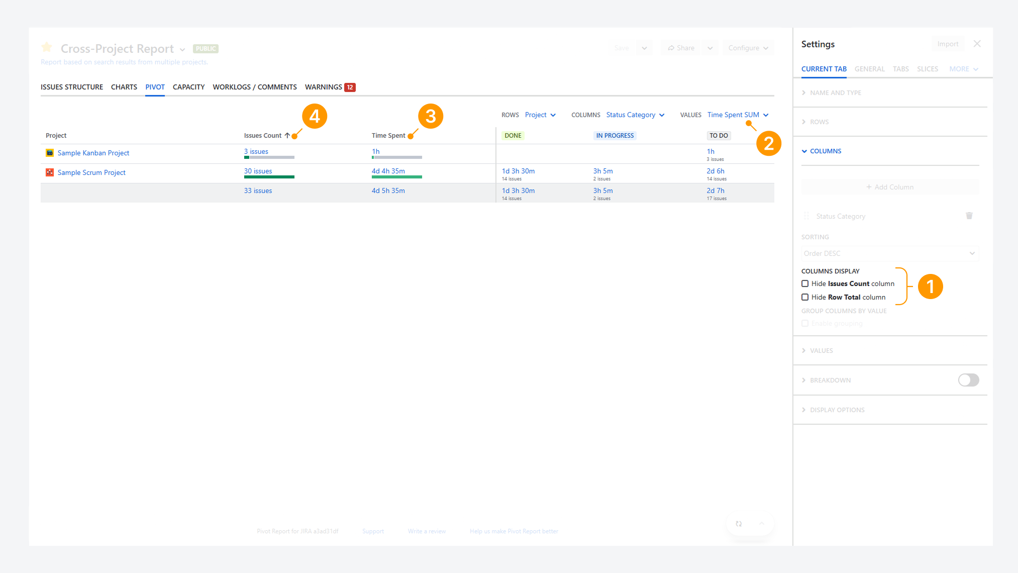
Yes. You can sort the Issue Count and Row Total columns in the Summary section by following these steps:
-
Open Column display options and choose whether to hide Work item counts, row totals, or leave both visible.
-
In the Values dropdown, select the field you want to use for the Row Total column.
-
To sort the Row Total column, click its column header. In the example, the Time Logged is not currently sorted.
-
To sort the Work item Count column, click its column header. In the example, this column is not currently sorted. In the example, Issue Count is sorted in ascending order, indicated by an upward arrow (↑)
Troubleshooting
If you have questions or need assistance, contact our support team via email or service desk. Our team is available Monday through Friday (9:00 AM to 7:00 PM GMT+7) to help with technical challenges or discuss improvements.